As I discussed in my previous post, my largest perceived weakness going into an event such as Ludum Dare was my graphic-making abilities. This past weekend, I took my first step toward exercising that particular skill. Prior to this weekend, I had never created a sprite in my life (that wasn’t entirely one color). Heck, I never even doodled in my notebook in middle school.
Where to Start?
At first, I really didn’t know how I would go about improving myself. Isn’t the designing of sprites just art? Isn’t visual artistic ability just something you’re born with? My brain is so imbalanced to the left hemisphere that I’m constantly falling into traffic. What kind of fool’s errand am I going on here? However, throwing doubt to the wind, I set out to build a sprite.
The first task I gave myself was to pick a graphics tool. I tried some of the ones list in the Ludum Dare Tools section, but didn’t see anything that struck my fancy. At one point I was on Chapter Two of a PyGTK Tutorial in the hopes to build my own tool. Luckily I shut down that bit of insanity. Eventually, I decided to just work with good ole’ Gimp, which worked better than expected.
Next, I went scrounging for tutorials. I didn’t think I’d actually find anything worthwhile, but I was badly mistaken. If you’re a programmer looking to get started with Pixel Art, you MUST read Derek Yu’s Pixel Art Tutorial. It breaks things down step-by-step, which is extremely helpful. Don’t be afraid by Derek’s amazing looking image, the ideas transplanted just as easily into my practice images.
I started very simple: following the tutorial to create a dead-simple picture (a machete). It wasn’t too shabby, but it was also a pretty simple image to begin with. So I decided to go with something a little more advanced to really test myself. I already had some sprites pulled from the NES Game “1942″ to use for graphics in a game I’m screwing around with, but maybe I could replace them with some sprites of my own. So, I would use the tutorial’s lessons to create my own sprite of a fighter plane.
Step One: Draw a Concept
Clik here to view.
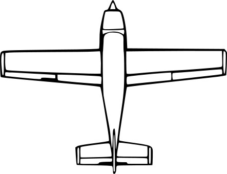
Some Clip Art I found to use as inspiration
For me, step one was to get an idea of what I wanted to draw. For Derek, this is Part Three (yeah, I’ve purposefully renumbered the steps to make things confusing for you). First, I googled for a top-down view of a plane, and found something to use as a concept. Next, I tried to draw with pencil and paper a likeness of this plane. I’m not really sure why I decided to do this (after all, I already have some concept art in front of me) but it just felt right. Later I decided that this worked pretty well, as the image I drew was something that I knew I could at the very least draw, which gave me a boost of confidence. It also allowed me to customize the image a bit more to what I wanted. Now to be sure, my drawing abilities are very sub-par (and fortunately for you, I didn’t scan the image I drew), but by studying the original image part by part, I was able to get something decent.
Step Two: Pixel an Outline
I created a new 64×64 pixel image in Gimp, and prepared to embarrass myself. Finally, I ended up with the following:
Image may be NSFW.
Clik here to view.
Some things to note about this:
- Although you don’t see it in the screenshot above, when working in Gimp I made sure to enable the grids so I had lines separating pixels.
- There are some jagged lines. While I did heed the tutorial’s warning, I felt that there wasn’t much I could do about some of the jaggedness, particularly near the back of the wings. I hoped that they would come out later in the process.
- Learning how to use the various Gimp tools to draw/erase/etc in a straight line is pretty helpful. Particularly, it is faster to use this method to draw a line rather than placing every pixel with the pencil tool. Even lines that are drawn at strange angles will give you pixels to start with, and you can just fine tune the resulting line with either the pencil or erase tool
- Speaking of the erase tool, you’re obviously going to need to set it to “Hard Edge”.
- One tip is to have a second view open to see what the image looks like in it’s actual size. After you’ve opened your Gimp window and have zoomed in on the image so you can work with the pixels, click “View -> New View”, and Gimp will give you another window that you can set to a different zoom (which is probably best to keep at the default zoom)
Step Three: Add Color
The next step was to add color. I bucket-filled the areas. This was actually pretty nice, since I have always been under the impression that if you bucket-fill a sprite it’s going to look terrible, and the only way to get something decent is to color each pixel individually. You’ll also see that I decided to add a propeller blade to the front for no particular reason.
Image may be NSFW.
Clik here to view.
These are just three colors that I randomly picked. Some day I might actually learn about color theory and all that, but I’ll save that lesson for some other day. Already, I’m pretty darn impressed. I would be happy with this! However, there is more that can be done.
Step Four: Shading/Lighting
The next part is what really makes the image “pop”.
Image may be NSFW.
Clik here to view.
I’m not sure if I got it “right”, but I did get… something. Notes on this step:
- The basic idea, as explained in the tutorial, is to pretend that there is a source of light, choose the direction it’s coming from, and draw where the shadows should go. Also, lighten where the light hits directly. I sort of changed my mind up half-way through where the light was, so I might be kind of all over the place. Especially on the right side of the tail section. However, it should be pretty clear that the light is above the plane’s vertical axis, and to the left.
- Here, the dodge/burn tool is your friend. The dodge will lighten, and the burn will darken the pixel you click. Remember to set the tool to “Hard Edge” or else it will affect multiple pixels!
- Although it might be obvious to some, this wasn’t to me: if you have the default color for the pixel and you dodge (lighten) it, then decide you’d rather keep it at where it was, doing a burn (darken) will NOT get you back to your original color. You’ll need to undo, or just redraw the pixel
- I reread the tutorial after I was done, and one tip was to do the shadows (darken) first. You’ll end up drawing more shadows this way, which sounds like a good thing. Think about it: with a single point of light, you will have more areas with less light (shadows) than you will being directly hit by the light. I’ll have to keep this in mind next time.
Step Five: Selective Outlining
Image may be NSFW.
Clik here to view.
As you can see, the pixels that I drew for the outline back in Step Two have been dulled down to the colors that are surrounding them. This makes the image less “hard” (or using Derek’s words, “less cartoony”).
- I made use of the “Smudge” tool. As with the other tools, I made sure to set the “Hard Edge” option so that I would be affecting one pixel at a time. The way the “Smudge” tool works is you click and hold your mouse button on one area (i.e., a blueish pixel in the cockpit window ADJACENT to a black “outline” pixel in the cockpit window), and then drag the cursor INTO the black “outline” pixel. You can think of it as smudging your finger across the page, pushing some of the blue onto the black. Really, what this means is that you get some blend between the dark black and the light blue, without needing to manually pick the dark blue color. The cockpit glass is where it’s most noticeable, but I did it for the majority of the outline pixels.
- Unlike the other tools, the Smudge tool requires a bit more finesse, since you have to “drag” color from the correct source pixel into the correct destination pixel. Obviously, this can be a pretty long process for all of the outline pixels. If I knew that there would be a large group of pixels in a row that would all have the same smudge source color, then I would smudge one of them. After, I would use the Color Picker tool to select the new color that was created, and use the pencil tool to draw that color onto other pixels that would do the same thing. This was especially effective for those long, straight lines of outline pixels.
- One thing I could have concentrated on more was to do the selective outlining a bit lighter on the very outside edges of the sprite, as suggested. I played around a bit with the smudge settings, but could have gone even further by using the dodge tool to lighten up these pixels even more.
I Survived!
It’s by no means worthy of the video game hall of fame, but it’s better than stick figures. Some final thoughts on this entire process:
- In total, it probably took me a bit over an hour for this one sprite. I imagine I can cut this time down by knowing the keyboard shorcuts for gimp, which I was only partially familiar with. Another was the fact that I did this using the trackpad on my laptop. A mouse on a desktop would probably be faster.
- While Gimp has great toolage for messing around with a single image, I can imagine creating animated sprites would be difficult. On the one hand, Gimp has nothing built in to animate the sprite as you’re creating it. On the other hand, it would not be too hard to write a program that simply animates the sprite for you that you can stick into one corner of the screen while Gimp is open.
Comments/criticism welcome!